
What is happening out there on the streets? Or, rather, on the walls and subways and sidewalks where street artists and advertisers show off their new ideas. In this new, occasional department, we ask design professionals to tell us what they see when they traverse the city. What tricks are advertisers using? Is pink the new orange? Michael Surtees, an art director at Renegade, a Chelsea-based design agency, and founder of the blog DesignNotes, took us on a tour of Soho (with a few other downtown stops), where bold colors, eighties video games, and surly little childhood characters are dominating street art and creeping into advertising.
1. WHERE IS ALL THE POLITICAL ART?
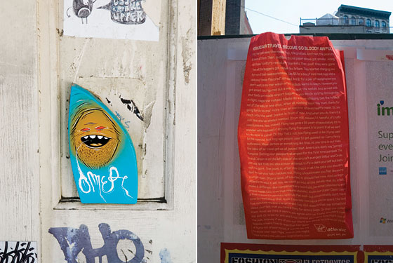
Candy Corn (74 Grand Street) and Windorphins poster (Crosby Street), above.
“I’m seeing a ton of bright, neon colors and bold, clean lines out there. There’s also a lot of irony, but not in the political sense. Typically, when you have major controversies in politics, you see street art reflecting that. But you don’t see a ton of characterizations of Bush the way you saw back in the eighties with Reagan or Margaret Thatcher. Instead, people are grabbing imagery from their childhood and injecting sarcastic twists on characters—maybe it’s a cute image with some snarly or sad expression, like this candy corn by a street artist named Broke Rodriguez. People in their twenties and thirties had toy figures like Transformers, Smurfs, Lego. Now that they’re older, they’re expressing a disconnect with the times that we’re in. They’re making more of an apathetic statement. This kind of aesthetic is showing up in corporate art too, like this poster for Windorphins—a campaign for eBay. It’s funny that both are sort of chemicals: the candy is sugar while Windorphins are a fake chemical reaction—endorphins that come from winning auctions.”
2. STREET ARTISTS ARE GOING 3-D
Evil Little Blue Wooden Character (74 Grand Street) and Virgin Atlantic Sick Bag (spotted throughout Soho and the city)
“Wheat-paste posters, stencils, and stickers are what we’re used to seeing in street art. Now you’ll see these bright wooden characters everywhere—different artists are doing them—propped against lampposts or even glued to walls. This blue, little evil guy is glued to the entrance of a building that street artists have been marking for a while. The 3-D format jumps out at you—you want to pick it up. Unlike posters, these are tactile objects that you would expect to be able to pick up and take home (i.e., steal), but they are usually held down by industrial-strength adhesives. It’s kind of a tease. As for the Virgin barf bag, Virgin is one of the few companies that are willing to take risks with their advertising. This is an expensive ad that won’t last long—if it rains, it’s ruined. The type is stylistic—they don’t expect anyone is actually going to read this. A lot of advertisers are using typography these days as an aesthetic choice. On one level, it’s just a pattern. On another level, there’s the idea that you’ve got a writer who created something—that there’s a personality behind the advertising.”
3. NOSTALGIA FOR ATARI, YET AGAIN
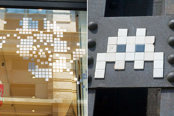
Bitmap on Kazuyo Nakano boutique window (117 Crosby Street) and Space Invader (Eleventh Avenue, behind Chelsea Market)
“Remember Space Invaders? I used to play the game in the eighties on my Atari, and so, probably, did the street artist named Space Invader, who created this image [bottom]. Again, it’s a character associated with childhood, the alien image taken out of context. He’s taking a digital image and placing it on a wall with common materials like tile. In the store-window display, the gridlike image also tries to be digital by using pixels (squares) but doesn’t come off as anything that a game from a computer would look like. This bitmap is a dumbed-down version of the techy feel of the street art. There isn’t much of a grid, the squares are all over the place. They have tried to make a pixel image but kind of failed to really create any type of feeling or meaning. Part of the success of the Space Invader image is in the restraint—it is complicated to get such a simple image across. There’s no real rhyme or reason with the window display. It’s a bit sloppy.”
4. NEW DIRECTIONS IN SIGNAGE
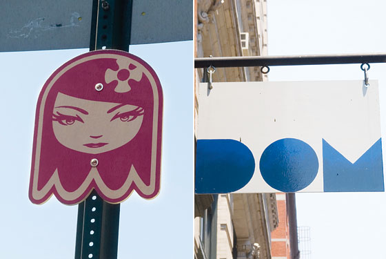
Wooden Girl (Lafayette Street) and DOM Showrooms sign (66 Crosby Street)
“When I first saw this girl, I wondered if it might be an image from an actual brand. But it’s not—this is the work of a street artist named Matt Siren. But I only know this from doing my own digging online. In terms of a brand campaign, Siren has a lot of bases covered—there are stickers, posters, a Website. But this wood character, screwed to the street sign, how often do you see that? The artist is repurposing the street sign and taking a lot of time to do so—it’s got the clean lines that I’m seeing elsewhere and which indicate good craftsmanship. There’s a lot of effort that goes into creating something like this: Make the illustration, place it on wood, cut it, and then find a suitable signpost. You have to screw it in by hand—you are more likely to get caught doing it. Looking at the dom sign—it’s the same kind of sturdy, 3-D wood sign hanging well above eye level. But, when the store is shuttered, who knows what DOM is? [It’s a design showroom.] Again, the bright colors and simple lines come into play—they are using circles, triangles, and squares to create a sophisticated but discreet image.”