When it came time to assemble Vulture’s annual list of the best and worst movie posters of the year, we were faced with a conundrum: How could we find a way to include the hilarious poster for Nurse 3-D, which features a blood-soaked and nude Paz de la Huerta? Alas, even though that poster was released in 2011 (before the movie was even shot!), Nurse 3-D won’t be out until 2012, and so we decided to disqualify it and a few other striking one-sheets — like the recent teaser poster for The Dark Knight Rises — until next year. Over these ten slides, then, you’ll find the best and worst the movies of 2011 had to offer, and a few cases where a movie went from one good poster to a stinker (and vice versa).
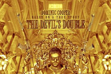
How do you sell a movie about the gaudy, over-the-top son of Saddam Hussein? With a deliciously gaudy, over-the-top poster so dipped in gold that it ought to be tossed on James Bond’s bed. How long before a version of this poster is re-created for some enterprising rapper’s album cover?
Though FilmDistrict was
sued for advertising Drive like a Fast and the Furious movie, you’d find no evidence of that approach in the movie’s too-esoteric poster campaign, which takes a thrilling car noir and reduces it to random one-sheets of actors doing nothing. “Hmmm, a movie where Carey Mulligan is standing? Consider my ticket bought!”
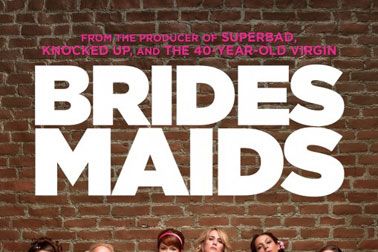
We hear that dressing nicely for a picture while incongruously “going hard” is one of
the fifteen things that girls are most likely to do on Facebook. If that’s the case, then Bridesmaids knows its audience. Like the movie itself, this poster works on men and women, and it’s a clever concept that feels like an additional joke or set piece, not just a simple summarizing image.
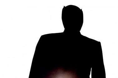
The nephew of somebody important just started working in 20th Century Fox’s marketing department! He’s turning 19 this Thursday and he’s going to get a really big cake!
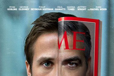
This poster is a little bit weird and unsettling — so much so that director George Clooney was hesitant to use it — but it’s a concept ad that actually works the more you think about it. And unlike most floating-head posters, it actually forces you to think about it. (Extra points for truncating Time to just Me, an additional meta little detail.)
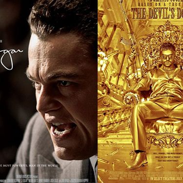
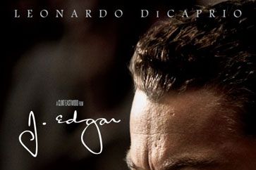
Ooooooof. Way to find the most unappealing still and typeface for a movie that’s already a bit of a tough sell! J. Edgar could have been marketed on all the juicy secrets its protagonist knew, but instead, they decided to go with Leo giving Full Bulldog.
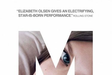
Every year, Sundance filmmakers hope to snag Fox Searchlight as a distributor, and it’s no wonder why: The specialty studio is one of the best in the business at putting together a marketing campaign. This Martha Marcy May Marlene poster took a tiny drama with a brand-new actress and put together an image that’s immediately arresting and intriguing. Even better were the MMMM online ads, where Elizabeth Olsen’s partially obscured face would occasionally fidget to life. Clever and creepy.
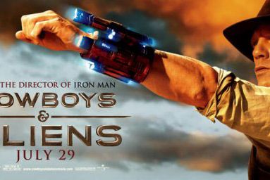
Cowboys & Aliens kept switching up its ad strategy in an attempt to find something that worked, and late in the game, the studio ditched a moody shot-from-behind one-sheet of Daniel Craig to settle for this, a random production still. Unfortunately, the marketing campaign needed a stronger take that would tie together all of the movie’s wildly disparate elements — including title and tone — though if the talented filmmaker and cast behind Cowboys never quite figured out those issues, who could expect its ad execs to?
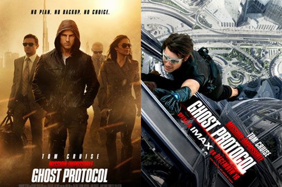
All year, Paramount execs have been releasing the most random posters of Tom Cruise in a hoodie to advertise the newest Mission: Impossible installment, and though they eventually incoporated members of the ensemble cast, everyone was plopped in a blah sandstorm. Finally, the studio appeared to realize they were selling an action movie, and so a new poster was made touting the film’s most vertiginous stunt: Cruise hanging off the tallest building in the world. We’re still not sure why Paramount insists on emphasizing the subtitle “Ghost Protocol” over Mission: Impossible, but the new one-sheet is a dramatic, exciting improvement.
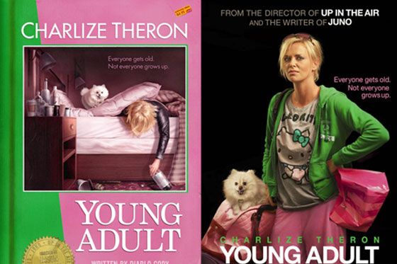
What happened here? The first poster for Young Adult was smart and creative, and the only marketing sin it committed was not featuring the face of star Charlize Theron. How to remedy that? With a Photoshop cut and paste job that pulls an unappealing image of Theron out of a still and drops her in front of a black background. When Young Adult had a series of pop-up screenings this season, director Jason Reitman asked local artists to come up with their own fun one-sheets; it’s a shame that none of that thoughtfulness made it into the final poster.
