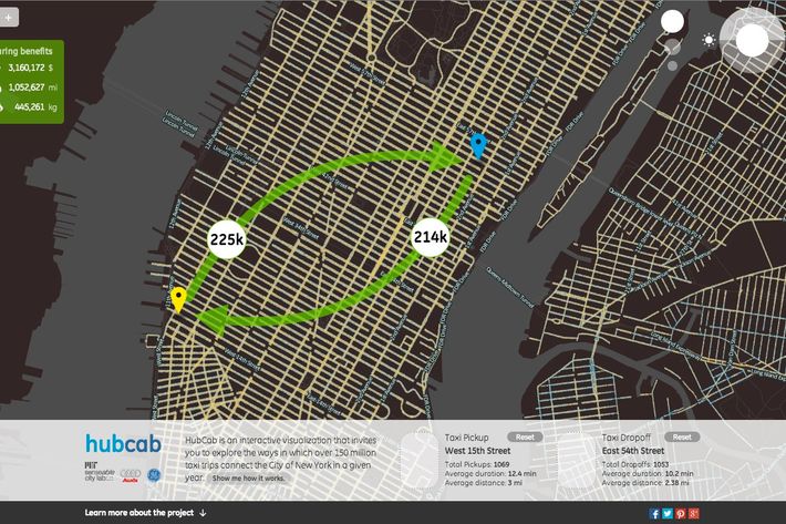
Gizmodo has pointed us in the direction of HubCab, a project from MIT’s SENSEable City Lab using GPS data to map the routes of all 170 million trips of New York’s 13,500 yellow taxis in 2011. The map’s interactive feature allows users to see how many cabs were on the roads at different times of day throughout the year, the number of pickups and drop-offs on any given street, as well as the average ride’s distance and duration. In addition to being very beautiful, the display has a practical purpose: It also shows the money, distance, and carbon dioxide emissions people could save by sharing the car with someone else. According to HubCab, splitting the ride “could reduce the number of trips by 40 percent with only minimal inconvenience to the passengers.”
The point is to demonstrate to New Yorkers how much better it would be — for the environment and their wallets — if the technology used to create HubCab, as well as already existing taxi apps like Uber, were to be used to make a big “shareability” system. Obviously, this might be a tough sell: Drivers generally want more fares, and many people simply won’t sit in a car with a stranger. Still, it’s an idea worth thinking about, even if only a fraction of passengers actually want to make use of it.