

As you have no doubt heard, the Dow Jones Industrial Average reached an all-time intraday high today and will probably close at a record level tonight barring a late sell-off. There are any number of reasons why this fact isn’t as important as it seems, including the fact that the Dow is just a price-weighted basket of 30 arbitrarily chosen stocks, and the fact that it isn’t adjusted for inflation (if it were, it would still be 8 percent below 2000’s high mark).
I’d argue that the Dow is more important than its haters claim — if only psychologically, because Main Street still views it as a proxy for the health of the stock market and their 401(k) portfolios — but it’s true that there are economic data out there that matter a lot more when it comes to the overall health of the economy. Here are a few figures and charts you might want to lean on today, instead of the Dow’s flashy new high.
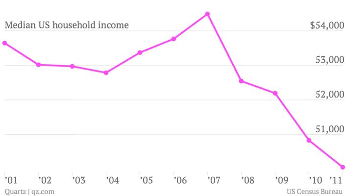
1. Wallets are slim.
As Quartz notes, the Dow’s all-time high doesn’t mean that actual Americans are reaping the benefits. As this chart shows, U.S. median household income, adjusted for inflation, is moving in the wrong direction as of 2011, the most recent year census data were available. And even though unemployment has fallen and consumer confidence has picked up since then, the household income numbers still aren’t rising nearly as fast as they should. Especially given that corporate profits are somewhere in the stratosphere.
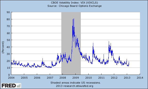
2. The markets aren’t scared.
The CBOE Volatility Index, or VIX, is the so-called “fear gauge” of the stock market. It measures market expectations of volatility for the next 30 days, and is often a pretty good proxy for how much of a roller-coaster ride Wall Street investors are or aren’t preparing themselves for. Right now, as you can see below, the VIX is near a ten-year low and has been since late 2011. Which means that even though Washington politicians are freaking out about sequestration and the deficit, investors are feeling pretty confident that the dark days are over.
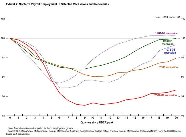
3. The recovery is taking longer than it should.
In a speech last month, Federal Reserve vice-chair Janet Yellen showed this chart, putting this economic recovery in the context of other recessions in previous decades. As the red line at the bottom shows, this most recent post-crisis comeback has been slower than most, with unemployment remaining higher for longer. This disparity is primarily due to the fact that politicians in Washington are more concerned with deficits than unemployment, and that federal, state and local governments have been cutting back on spending just at the time when it’s needed most.
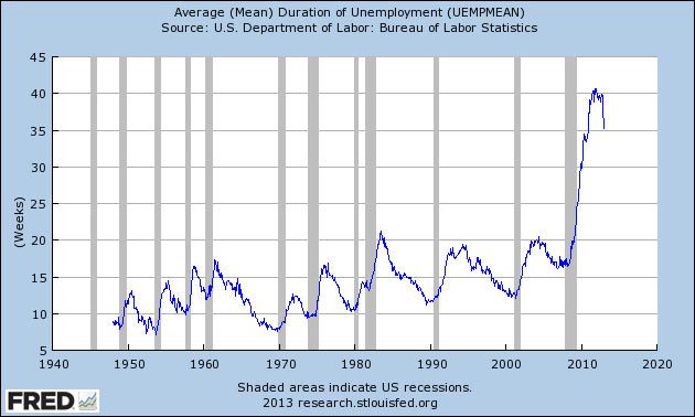
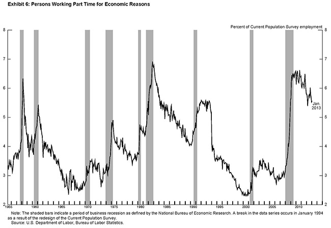
4. Good jobs are still scarce.
We know, because politicians keep reminding us, that the 7.9 percent headline unemployment rate means that millions of Americans are still out of work. But what most people don’t realize is that the average unemployed person is unemployed for much longer than they should be, a figure that doesn’t get as much attention in the monthly job reports. Today, as the below chart shows, the average unemployed person is out of a job for roughly 35 weeks. And as Yellen also noted in her speech last month, the number of people who are working part-time in order to make ends meet, at jobs they are likely overqualified for, is still distressingly high.
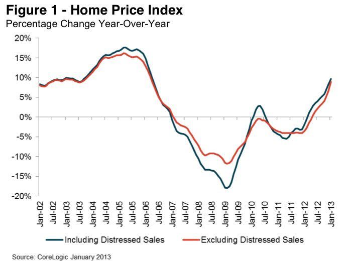
5. Housing is doing so well it’s scary.
After four downer charts, here’s some good news: Even though unemployment remains high and foreclosures are still happening in waves across the country, the people who do have homes are seeing them gain back a ton of value very quickly. According to CoreLogic, which built the chart below, home prices are on a tear in recent months, gaining roughly 10 percent in the last year and rising in eleven straight months. Home prices are still well below their pre-recession levels, but the housing recovery is happening so quickly that some experts (and magazines with ill-considered cover art) are cautioning about a bubble forming. (Didn’t we just have one of those?)
As these charts show, even though the Dow is at a nominal all-time high, the economy is far from healed, and millions of Americans are still suffering through the aftershocks of the recession. Big, flashy headlines about today’s high are understandable — the Dow is an indicator most regular people can identify with — but they also risk distracting us from the real challenges we still face.


