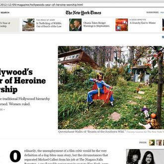
Yesterday, the New York Times revealed the first steps to redesigning its website, a delicate affair for an institution the world expects to remain steady. But it’s neither drastic nor sudden, more like a warning with purpose from an industry leader still working out its transition into a digital future. The changes will start not on the home page, but on individual article pages, where there will now be more white space, larger images, and a more tabletlike navigation bar.
And instead of rolling it out all at once, the Times is taking things very slowly, offering early access to a select few and working from there. “We’re referring to this as a prototype because that’s what it is,” said digital design director Ian Adelman, a veteran of the very site you’re reading. “It is not the actual website in a prereleased state. It’s something we built to put in front of our audience and get feedback.”
Adelman would not say how long the project has been in the works (“It’s very sensitive with different teams”), but he continued to stress that they’re not done. “If you look at the essential experience of the website, it hasn’t been redesigned since 2006. Does it need to be redesigned? Everyone has a different answer to that. But the way we develop the website as an application is more like an iPad app. You expect it to continuously improve and add new features and be refined,” he explained.
“Part of the reason that this is coming out now before it’s finished is we have some assumptions about what’s going to create a better experience for readers, and we want to hear what they have to say. The feedback will be incorporated into the product.”
“We’re just comfortable saying it’ll be later this year,” he said of the full release. And then “we will be working on the home page. There’s not a particular timeline.”
For now, in this era of the increasingly obsolete home page, the focus is where people actually do their reading. Long-form articles, Adelman said, “are the pieces that are going to stand out.” The success of the paper’s extremely long and elaborately designed “Snow Fall” story was a promising sign, but Adelman hopes “that more of that integrated media experience will just permeate the fabric of the publication.”
For example, “We are eliminating pagination of longer articles,” he said. “People spend more time and read further into a piece when the paging obstacle is removed.” There’s also more room for visual content, and reader interaction will become more prominent: Comments will be presented side-by-side to the actual text, perhaps leveling the playing field in a way Times readers might find jarring. “This is all part of the experiment,” Adelman said. “We’ll see whether people find it useful.”
The navigation bar up top is also “completely editable,” he said, another perk for subscribers and a plus for those considering paying to get around the paywall. “If you have particular habits, we want to make it really easy to support those. If you’re not logged in, it’ll be constrained to our top sections.” (Update: Adelman clarifies that the customizable navigation isn’t limited to subscribers, but does require registration: “By having it tied to your registration, we can display your customization across different devices/browsers.”)
As for influence from around the web, the new Times layout calls to mind sites like the Verge, NewRepublic.com, and Quartz. But Adelman insisted they’re all headed in the same direction: “One major influence on this site is the idea that in the not-so-distant future, tablet and touch devices are going to dominate,” he said. “If you look at navigation on sites redesigning lately, it’s patterns that people have become accustomed to because of mobile interfaces. Familiarity is a very powerful thing.”
Still, the Times anticipates some backlash — people hate change, especially on their favorite and most frequented sites — but sometimes what readers say they want might not accurately reflect their habits. “One of the things about putting a prototype in front of an audience,” Adelman said, “you get some subjective verbal input, but you also get to observe behavior through objective metrics. That’s what really matters to us.”
“We want to get this out in a way that allows us to respond in a meaningful way,” he said. “We’re going to continue to build on it. This is just the beginning.”


