Arguably, the most important document in the entire world of business is the annual report. Every year, public companies are required by law to release a summary of their yearly financial results and a discussion of developments in their business, usually with a letter from the CEO attached to the top saying how great the year was and how the next year will be better. And every year, these annual reports are dreadfully boring to read.
But this week, when I cracked open Goldman Sachs’s annual report to read up on the bank’s finances, I was surprised at how … good-looking it was. Not only had Goldman custom-designed an entire section of its website for the annual report, but the PDF version (downloadable here) featured large, bright photographs of employees of all ages, genders, and races, all working in harmony together. (There’s one, above.) The thing looked less like a routine corporate disclosure than a United Colors of Benetton ad, or an admissions brochure for a liberal-arts college.
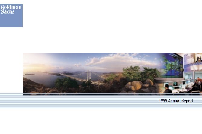
Inspired by this year’s masterpiece, I decided to take a look back at all the covers of Goldman’s annual reports dating back to 1999 and see how the bank’s style has evolved. Because while you can’t judge a bank by its annual report cover, you can tell how much money it’s spending on graphic design and photography.
In 1999, Goldman was a baby company. It had just gone public, and its annual report looked appropriately amateurish.
By the time the new millennium struck, Goldman had progressed from stock photography to this geometric design.
And in 2001, it went back to basics.
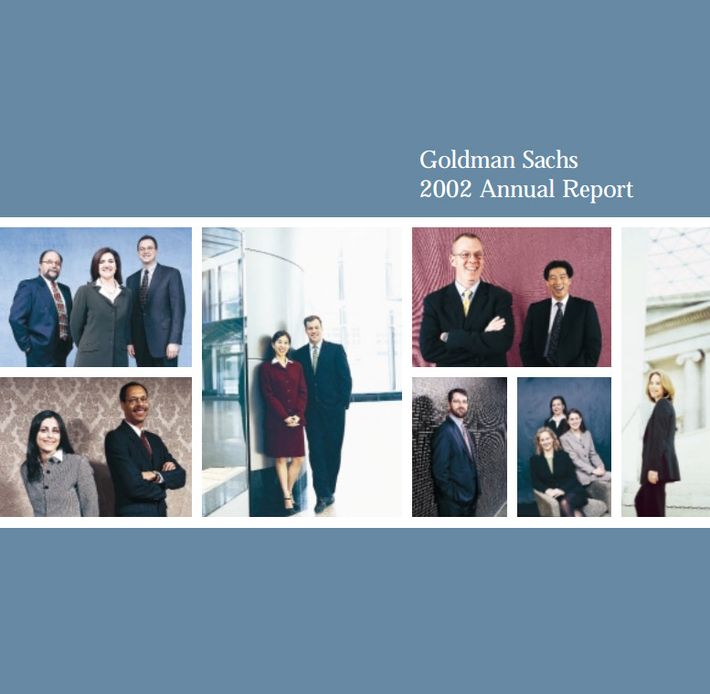
2002’s annual report looked like it was put together at the Sears Portrait Studio.
And in 2003, the bank made a motivational poster for your doctor’s office.

For 2004’s annual report, Goldman ran out of time, and just slapped its computer desktop background on the cover.

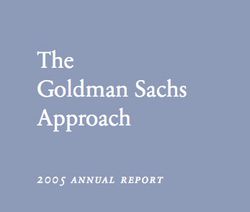
And in 2005, it just gave up.
In 2006, Goldman debuted its disyllabic marketing slogan — “Clients. Markets. Culture.” — and spent some time crafting a colorful mosaic of hard-hats and trees. (Because nothing says “we’re making soooo much money shorting the housing market right now” like an arboretum.)

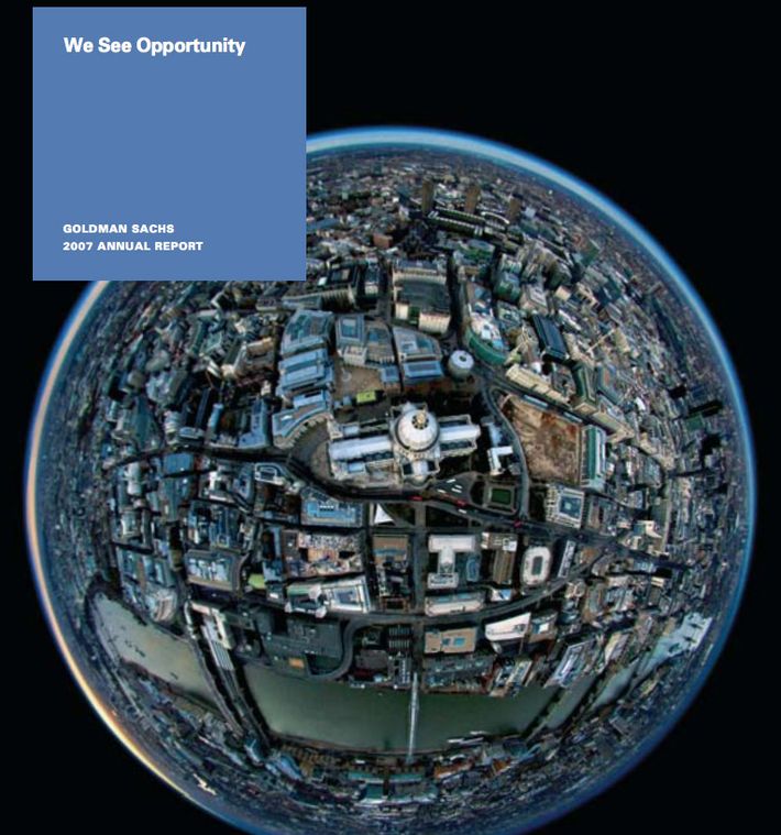
Goldman gave up on the trees and the slogan in 2007, and went with a fish-eye shot of a city.
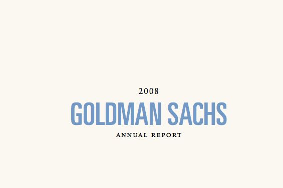
After the financial crisis of 2008, in keeping with the austere economic times, the bank went back to 2005-level visual sparseness.
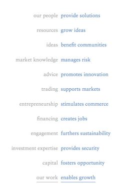
In 2009, though, as it came under attack from Main Street, Goldman switched to a Ten Commandments–style list of its values.
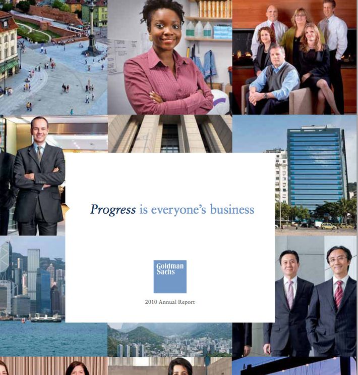
2010’s annual report hosted a new slogan — “Progress is everyone’s business” — and the first hint of the college-admissions-brochure style it would adopt in later years.
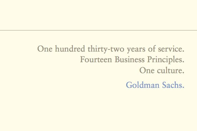
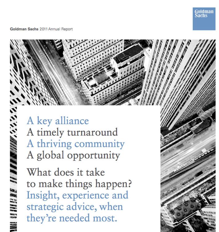
Last year’s report, which covered the bank’s activities in 2011, had WAY TOO MUCH TEXT.
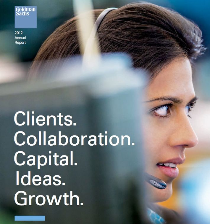
But this year, the bank wised up, and pared the cover down to five words, plus a large photo of a comely female employee.
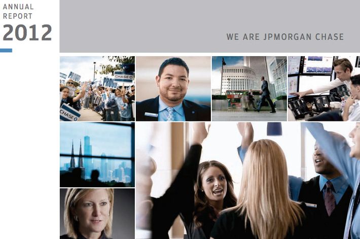
Most of Goldman’s competitor banks have similarly well-designed annual report covers. Here is JPMorgan Chase’s:
And here is a scene from Citigroup’s report:

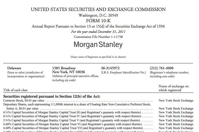
There is one notable exception, among Wall Street banks, to the over-designed rule: Morgan Stanley, which spends exactly zero dollars designing its report. Somehow, I think this one might be the most beautiful of all.