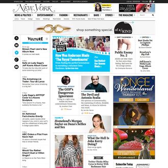
Today marks the launch of a new look for the nymag.com homepage, the first in five years. It’s intended to be a renovation rather than a teardown, but there are a few changes to explain. Because we know how much everybody loves a redesign, here’s a quick explanation of how the new page works and why we believe it’s better than the old one.
1. Get more stories faster. Previously, the Daily Intelligencer feed of stories appeared in the top left corner of the homepage. Now all of our blogs can be accessed from that area. You’ll see some icons to the left of this column. The top icon, and default setting, is an editorially curated list of news headlines from across the site. Just mouse over the other icons to switch the headlines to the latest posts from Daily Intelligencer, Vulture, the Cut, and Grub Street — now it’s easy to see up to 40 stories in a few seconds.
2. Browse clearly displayed features. The old nymag.com homepage was, it’s fair to say, quite busy. The new page still delivers a lot of stories, but we’ve tried to make them easier to choose from. Surrounding the lead, which changes four to five times daily, are the best features published recently on nymag.com; further down, our latest interviews, video, and photo galleries, plus Candy, a selection of amusements. Share counts under each story show how popular they are on social media.
3. Catch up on the most popular stories. Under the features, and just below the fold of your desktop screen, you’ll find a constantly updated list of the most-read stories on the site today, plus a selection of popular stories from the last few days. If you haven’t looked at nymag.com for a little while, it’s an easy way to see what you missed.
4. Find things to do, watch, and experience. At the bottom of the page, you’ll find the latest recaps and reviews from the critics at Vulture, curated event listings for New York City, and links to find nymag.com across all media — print, tablet, and social media.
5. Read on the go. The new homepage has been built responsively, which means it will automatically adapt to smartphones and tablets when you’re using those. It should be much easier to find stories on your phone now.
6. Scan a new, slimmed-down navigation bar. We’ve also introduced a new navigation bar across the site (which may further evolve in the next few months). The changes here are minimal. The site’s search box is now on the far right, and we’ve added the magazine’s table of contents to the menu of options.
7. Because we asked you first. This redesign involved extensive user feedback from the beginning of the process. We convened user focus groups to look at various layouts, then tested them live for weeks with a small percentage of users. All of the changes to the homepage are intended to address problems readers had with the old page.
8. Because we want to know what you really think. But now that it’s live, we want to hear what you like — and, of course, don’t like — about the new homepage. Please leave any feedback, or let us know about any technical glitches you’re experiencing, in the comments, or e-mail us at nymhomepage@nymag.com.


