Among the thousands of features on your smartphone, one you’ve probably never thought about is which fonts it uses. Typography is involved in almost everything we do on our devices — the emails we send and receive, the texts we compose, the tweets we scroll through — yet to most of us, letters are just letters, numbers are just numbers. We might pick Garamond over Comic Sans for a cover letter, but on a phone, who cares?
Google, though, is paying attention. It’s spent years trying to create the perfect fonts for Android devices, a sprawling ecosystem that includes small phones, big tablets, and everything in between. And now, as Google is installing Android into cars, TVs, and watches on your wrist, the company is attempting an audacious task: making a typeface that looks good on all of them.
“Typography is kind of the skeleton. It’s the unsung hero,” Matias Duarte, Google’s vice president of design, said in an interview this week. “We’re trying to give people one logical, consistent system.”
Google’s efforts to perfect a universal typeface began in 2005, when it acquired a small operating-system-maker named Android. Two years later, it released Droid, a family of fonts designed by type-design firm Ascender specifically for use on Android devices. Until Droid, many fonts used in mobile applications were holdovers from the desktop age — Helvetica, Arial, Verdana, and other household names. Droid looked markedly better on smartphones than those typefaces, but it had problems of its own. Droid fonts worked best on small, low-resolution screens like the ones on early Android phones. But on the larger, high-definition screens that were introduced in later models, the fonts looked off. The bold letters were too blocky, and some of the non-bold letter forms, which had been designed for low-pixel-density screens, looked insubstantial and oddly spaced in high resolution. “Droid struggled to achieve both the openness and information density we wanted,” Duarte later wrote in a Google+ post.
In many ways, designing a system font for Android is like trying to pick an outfit that will look equally good at the beach and a black-tie dinner. Unlike Apple — which only has to make its system typefaces look good on the iPhone, iPad, and a handful of laptops and desktops — Android’s open-source nature means that its default typeface will invariably be seen in hundreds of sizes, at thousands of resolutions, and on a million different apps. Whatever fonts Google designed had to look just as good on the 3.6-inch screen of a Casio G’zOne Commando phone as on a giant, 65-inch tablet viewed from across the room.
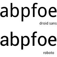
In 2011, Google released a new font family called Roboto, which it hoped would work across the Android universe. Like the typeface Apple uses on iOS devices, Helvetica Neue, Roboto is what’s known as a “grotesk” — a sans serif face that uses modern letter proportions — but Google added its own twist: “straight sided capitals and distinctive racetrack-shaped rounded letters.” Roboto, which was developed by an in-house team of Googlers led by Christian Robertson and released with Android’s 2012 “Ice Cream Sandwich” update, was a more compact typeface than Droid had been, which allowed designers to squeeze more letters into the same amount of space without creating a cluttered look. Here’s the before-and-after comparison:
Roboto wasn’t an immediate hit. Some type geeks dismissed it as a “Frankenfont,” a pastiche that borrowed heavily from other popular fonts, including Helvetica, the famous font that inspired a 2007 documentary. “Roboto is a Helvetica rip-off. It’s Google’s Arial,” tech blogger John Gruber wrote. Typographer Stephen Coles labeled it “an unwieldy mishmash,” and said, “This is not a typeface. It’s a tossed salad.” And though others were more complimentary – Glenn Fleishman wrote that “Roboto pricks at your sense of the familiar at first, but then, like a person you see passing in a crowd that you believe is a friend, and then on fully facing realize is a stranger, the font asserts its own identity” — Roboto was never truly embraced by the small community of designers who pay close attention to things like exit angles and ball terminals. (Google isn’t alone in this; Apple’s choice to use an existing typeface for iOS, rather than create its own custom typeface, has also come under heavy scrutiny from designers.)
Unlike pre-digital fonts, which were essentially set in stone after being finished, Google got to keep working on Roboto. And in subsequent editions, the typeface got a face-lift. The uppercase B got a little slimmer. The comma was made less angular. “The old model for releasing metal typefaces doesn’t make sense for an operating system that is constantly improving,” Duarte said. “As the system evolves over time, the type should evolve along with it.”
With its latest operating system, Android L, Google has made the most dramatic update to Roboto yet. The changes are part of Google’s new, somewhat inscrutable “material design” initiative, and unless you study fonts, you might not notice the difference. But under the hood, there’s a lot going on.
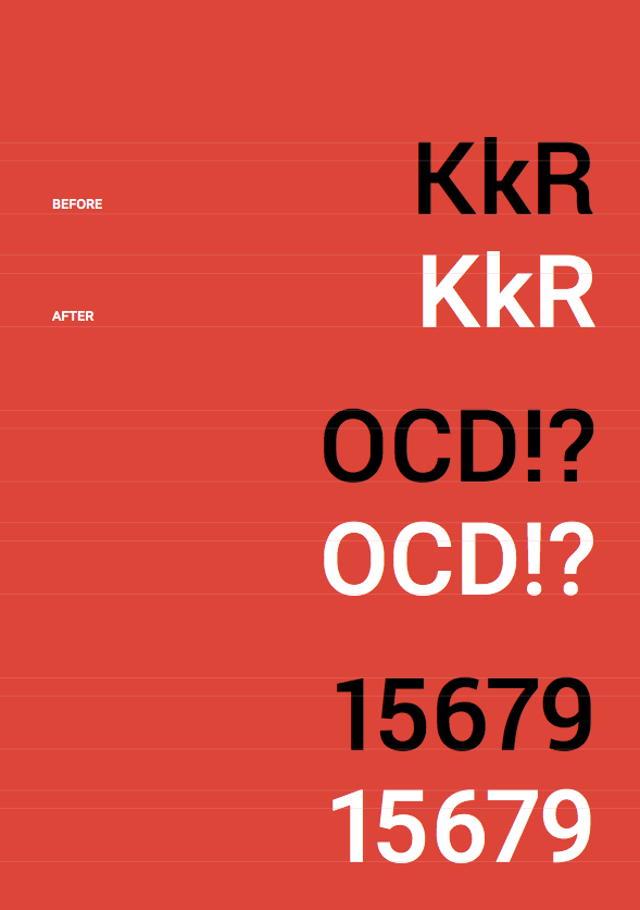
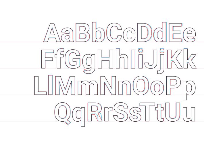
For starters, the whole Roboto font family has been “rounded out,” as designer Christian Robertson told me, with differences visible in letters including uppercase B, C, and D. The rectangular dots above the lowercase i and j have been turned into circles — an attempt, Robertson says, to make them look “friendlier.” The spacing of certain letter combinations has been tweaked. And some of the more unorthodox details — the curved leg of the uppercase R, for example – have been replaced with straighter, less ornate versions. The overall effect is that the new Roboto looks a bit more casual and less angular than the old one, more like a friend’s handwriting than a professional designer’s efforts.
Here’s a complete before-and-after, with New Roboto changes outlined in darker color:
Robertson told me that his team spent roughly a year and a half on the Roboto makeover – “every single character we’ve agonized over,” he said – and tested the typeface’s appearance on a “big pile of devices,” ranging from tiny smartwatches up to huge flat-screen TVs, to make sure it looked good at every size and from every angle.
These details might seem tiny, and they are. To the naked eye, many of them are even invisible. But Google has a reason to be extremely picky. Right now, there are more than a billion regular Android users, and each of their devices looks slightly different. With its material design push, Google wants to create a visual lingua franca, to make sure that every time you tap, swipe, or open an element on an Android phone, it behaves the same way. It’s an attempt to impose a small amount of order on a fragmented mishmash of devices, most of which Google has no immediate control over.
Unlike most innovations in computing, typeface design doesn’t succeed by grabbing your eye. In fact, if you notice the changes in the new version of Roboto, Robertson and his team have probably done something wrong. The goal of a good font is to be silently useful, to improve a readers’s experience without calling too much attention to itself. But if you notice, in the coming months, that your Moto X or your Samsung smartwatch suddenly starts to feel a little sleeker, and your emails and tweets get a tiny bit easier to read, it might be the new Roboto at work behind the scenes.