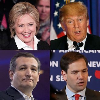
By law, campaigns have to disclose to the Federal Election Commission how much money they are receiving from the electorate. RentHop has done a nice job of plotting those data onto an interactive map, on which both the number of donors and total dollar amounts can be viewed. Clicking around confirms some narratives you’d expect. Certainly looking at your own area is always fun: Someone in my neighborhood actually wants Donald Trump to be president? But the map also punctures some narratives and reveals some surprises, too.
1. Hillary Clinton takes the deep-pocketed neighborhoods.
She practically owns Chelsea and Tribeca. The prime Upper East Side—which donated more than any other neighborhood, a total of $1.23 million, spread among 668 donors—gives overwhelmingly to Clinton as well.
2. Sanders takes the hipster enclaves, at least by number of donors.
In Ridgewood, Queens, 58 percent of them were Bernie supporters.
3. There isn’t really much difference between the Upper East and Upper West Sides.
A couple of weeks ago, Crowdpac noted that the Upper East Side was Hillary Clinton’s second-biggest-donating Zip Code, and the Upper West Side was No. 5 on Sanders’s list. This prompted a series of think pieces about the political difference between the affluent uptown ’hoods. The data, however, clearly show that Clinton has a much larger share of donors on both the Upper East and Upper West Sides (60 percent and 70 percent, respectively) than Sanders does, and has taken in far more money from each area than her opponent has (Clinton took in well over $1 million from the Upper West Side; Sanders, a bit more than $100,000).
4. Bernie is outraising Hillary in only one Zip Code that has a lot of donors.
There are many neighborhoods where Sanders has received money from more individual donors than Clinton has (Ridgewood, Inwood, Bed-Stuy, Sunnyside, Kensington, and more). But the only neighborhood where more than 60 people gave donations and Sanders received more money than Clinton was Williamsburg. (And, even there, it depends exactly where and how you draw the neighborhood boundaries.) In some neighborhoods, Clinton has taken in ten times as much money as the other candidates have.
5. Bernie’s vacuum pennies may not be showing up.
RentHop’s mapping tool counts only donations over $25. Sanders, as he says in his stump speech, has averaged barely more than that amount per donor. It’s possible that he’s got more money coming in than the map shows, because it’s in tiny amounts.
6. Park Slope, as usual, perfectly demonstrates liberal intramural arguing.
Sanders has the majority of donors there, 49 percent to Clinton’s 44 percent. (Yes, six percent of Park Slopers give money to Republicans!) But when you look at the total amount raised, Clinton is running away with the game: She’s raised $149,000 compared to Bernie’s $42,000.
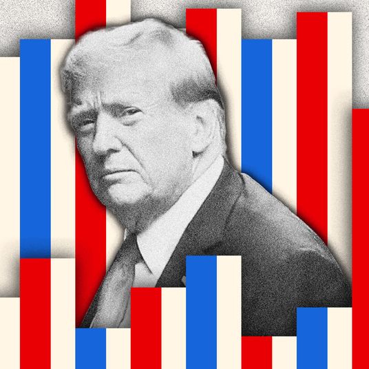
7. Trump is raising very little money in his hometown.
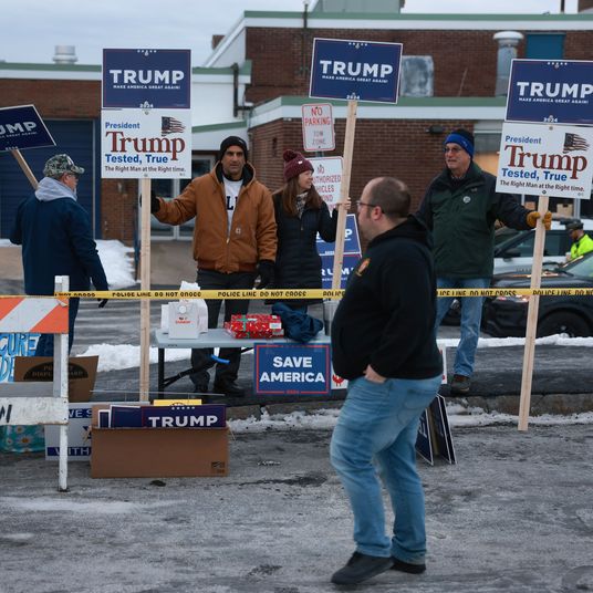
Donald Trump has repeatedly reminded the public that he is the only candidate who is self-funding, but that is only somewhat true. More than 25 percent of Trump’s campaign income is from small donations, and he has two “Donate” buttons on his homepage. Yet in no New York neighborhood has Trump received a significant number of donors; even on the Upper East Side, where he’s collected the most, the total is barely over $10,000.


