On Wednesday, Slack — the preferred chat platform of many a business — changed its logo. Where once there stood a four-color hashtag with pink, green, yellow, and blue lines, there is now a … honestly, better if you just take a look at it yourself. It was designed by Slack’s in-house design and brand team, who worked with Michael Bierut and a team from design firm Pentagram. (Bierut was the brains behind the Hillary Clinton’s 2016 “H” campaign logo.)
Intelligencer’s Jake Swearingen likened it to a “logo for a healthy insurance company.” On Twitter, it was called a “whimsical swastika,” “like a logo for a public swimming pool,” and “moist.” For me, the most irritating thing about the update is that the auto-filled avatars assigned to Slack users have all changed too. If a Slack user doesn’t upload their own photo, Slack assigns them a graphic from a selection of different close crops of the logo — which means that all of my colleagues have different avatars today than they have for the past, in some cases, several years. That makes it a little more difficult to scan over messages in group threads and know who is saying what just by looking at the avatars. How will I ever adjust to this new normal? The humanity.
So, why couldn’t we just keep the old logo? “It was also extremely easy to get wrong. It was 11 different colors — and if placed on any color other than white, or at the wrong angle (instead of the precisely prescribed 18º rotation), or with the colors tweaked wrong, it looked terrible. It pained us,” Slack explained, in a blog post.
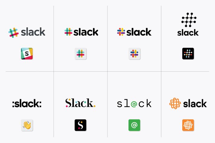
Pentagram also shared a blog post detailing the logos that didn’t pan out and the process behind the one that did. Upon seeing the other choices, I take back anything bad I had to say about the logo they went with. The new one is fine. Shoutout, though, to the person, or people, who dreamt up that one with the green @ in the middle. It’s, uh, really something.
As with any corporate logo change, everybody will forget they even cared enough to be mad or exasperated in a matter of days. (Is anyone still talking about how Instagram updated its logo to look like a preset gradient from a Powerpoint slide?) It’s not like it’s going to stop them from using the product. Excuse me while I send this post to my editor. Via Slack.


