In the afternoon of December 15, 2009, graphic designer Tyler Thompson arrived at JFK and watched as a Delta check-in kiosk printed out a limp receipt that was supposed to guide him through the labyrinthine airport and onto his flight to Seattle. Information he needed (such as the gate) and information he did not (he was plenty aware he was flying coach) were scattered across it, with no visual cues to their relative importance. Upon taking his seat, Thompson took out his laptop and began sketching his own take on the boarding pass. “Airports are not fun, and I thought if you could improve this one part of the experience, it would help,” he says. In the version he came up with, the most important elements appeared in big white type popping off a black bar. Within weeks, Thompson had launched a web page, Boarding Pass/Fail, asking other designers to offer their own overhauls.
On February 1, with little fanfare, Delta answered Thompson’s call. Two years into a $2 billion systemwide makeover, the airline’s designers have managed to remake the lowly 22-square-inch vade mecum at the heart of the traveling experience. In the Pan Am era, design helped package plane rides as luxury goods; in these newly design-conscious times, Delta is using it to burnish a mode of transit that’s come to feel grim. The result is an appreciable improvement—but also a case study in how hard it is for the industry to restore even a hint of romance to air travel.
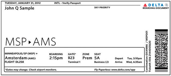
The new Delta passes have a streamlined look: cleaner type and a rational framework, with the most crucial pieces of information (boarding time, gate, seat) neatly reordered in the sequences most fliers would need them. The dominant element is the master itinerary rendered as a city pair, two three-letter airport codes linked with a small arrowhead evoking Delta’s logo toppled onto its side. Even fliers who don’t reflexively think Orlando when they see MCO can find some pleasure in this stylization of baggage-handler patois. For once, the insider lingo of the airport is used not as a tool to bewilder travelers into submission—think inconsistent fare-bucket designations, opaque code-share arrangements, impenetrable cancellation policies—but an invitation to a shared experience.
Or mostly shared: Twenty percent of Delta boarding passes haven’t yet been given the new look; computer systems used by some gate agents, check-in counters, and curbside stations aren’t ready for the change. In his own boarding-pass studies, Thompson learned of other constraints on Delta’s design work. The printers used in airport kiosks could not, among other limitations, handle preprinted color paper that would add flair and depth to the monochrome type.
Airlines make ripe targets for aesthetes, but it turns out blame ought also to be placed with the heavy infrastructure surrounding aviation. In this case, the obstacles are the kiosk printers. In others, it’s concourse layouts that squeeze amenities, or to-the-ounce restrictions on aircraft weights that leave comfort cut out. In the face of such burdens, it’s not easy for flights of fancy to take off.
Have good intel? Send tips to intel@nymag.com.