Last week, the internet allowed itself to be dragged into IHOP’s latest marketing ploy — the restaurant chain announced it was “changing” (but not really) its name to IHOb, and then made us wait a week before telling us that it stands for “burgers” and not “breakfast” or “Brian Eno”.
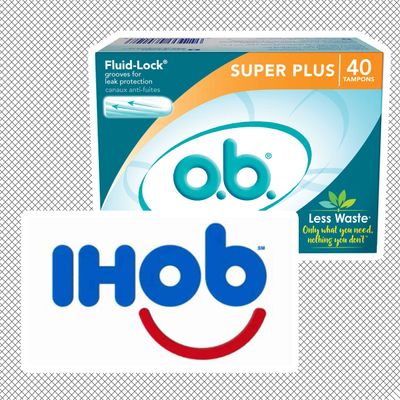
B-words aside, some on Twitter noticed a strong resemblance between the restaurant’s new logo, and the logo of a beloved blood plug.
The logo-change was not intended to promote feminine hygiene products, but IHOP’s new line of Ultimate Steakburgers that look exactly like every other fast food burger.
“People know us for pancakes,” IHOP chief marketing officer Brad Haley told journalists last week. “The goal is to get people to think about us for lunch and dinner. We have a lot of white space after breakfast.”
Is the IHOP/b marketing team so guy-heavy that no one noticed the o.b. resemblance? Are they all Diva cup devotees? Or was it, perhaps … intentional? Burgers and tampons have a lot in common, after all: You tend to buy them when you’re feeling bloated and emotional, they never seem to be around when you most want/need them, and they’re both full of blood. And most significantly, the o.b. resemblance means we’re all still, somehow, talking about IHOb.
Whatever the case may be, congratulations to IHOP for their maddeningly successful promotional gimmick, and to all of us for willingly participating in it like the capitalist pawns we are.


