Jasper Johns’s career began with a desperate act. At 24, in 1954, he said he wanted to “stop becoming, and to be an artist,” and destroyed nearly all his art. Then came a kind of vision. “I dreamed I painted a large American flag.” The next morning he began doing just that. His thoughts must have been racing; the enamel house paint he was using wasn’t drying fast enough to capture them. So he switched to something he “had read or had heard about”—wax encaustic. This extraordinarily sensual ancient medium, made of heated beeswax mixed with pigment, dries almost immediately, preserving every brushstroke and favoring process over deliberation. Using this technique, he began replicating something, as he put it, “the mind already knows.” Applying red, white, and blue encaustic over a collaged surface of newspaper and fabric, he created a sort of flickering movie and optical aftereffects under his fleshy material. By spring 1955, he completed the paradoxical machine for thought known as Flag, a painting that seems to take a second to see but a lifetime to come to terms with.
Since then, Johns’s career highs and lows have been documented and debated; admirers have turned him into a cult; detractors have disparaged him as “undernourished and overthought”; his art has been exhibited and sorted according to motif, medium, period, and iconography. “Jasper Johns: Gray,” the Metropolitan’s exhibition of 119 paintings, prints, sculptures, and drawings in shades of gray spanning 50 years, ushers us into Middle Kingdom Johns. Although the show is ravishing and brings you into close contact with the numinous ways Johns combines process, materials, tangibility, language, thought, and seeing, it’s too big. That in turn robs it of some of the radiance it had this fall at the Art Institute of Chicago. At the Met, the works are set too close together; a small alcove is crammed with ten pieces; shiny black floors, stark white walls, and a lack of natural light impede the resonant sensuality and obdurate otherness of Johns’s work. As alluring as “Gray” is, it reminds us that although the Met gets the first 50,000 years of art so right, it often gets the last 50 wrong.
What is great about this show, however, is the resilient way Johns’s art fights back. Initially, gray sounds like an arbitrary idea for a show, and a dreary one. In fact, looking at Johns’s work through this prism gives life to something buried. It helps viewers avoid the banal trap of trying to decipher his specific meanings (“the flag represents America’s place in the world,” blah blah blah, and all the other boilerplate). With gamesmanship and decoding set aside, you start to understand not only how Johns imposes thought on his work but how his work imposes thought on him. His short, repeating Cézanne-like brushstrokes, preserved in the encaustic, have the uncanny effect of slowing down seeing but speeding up thought.
Although Johns is a mysterious, rigorous artist, he isn’t a traditionally imaginative one. He doesn’t invent motifs, symbols, and subjects. Instead, he finds and then endlessly redeploys them. He’s like an icon painter, always returning to the same touchstones. As with icons, there’s almost no air, light, or space in Johns’s work—just physicality, faith in materials, and a devotion to craft. At the same time, Johns always seems to be starting over. His work has the perpetual laboriousness and diligence of a novice. He’s constantly circling back, trying out old things in new ways and new things in old ways. His marvelous show of new drawings at Matthew Marks Gallery contains American flags, numbers, letters, flagstones, and hatch marks. He painted his first flags and numbers more than 50 years ago, yet they’re still a fresh mystery to him. And to us.
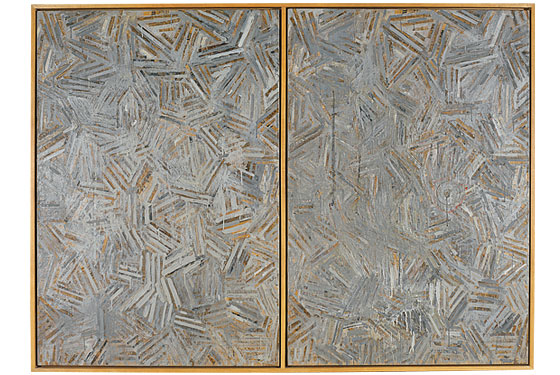
The show begins with a whoosh. On the first wall is False Start, a wild 1959 Rorschach of colorful brushstrokes depicting names of colors. Next to it is Jubilee, from the same year, a look-alike patchwork all in grays. The startling evaporation of color from one painting to the other flips a switch, and suddenly you’re in a psychic-cerebral state where everything, by its removal, also calls attention to itself.
Since Johns seems to want to create new units for thought and to get objects to work in more than one way, I suggest you forgo wall labels, and instead see what the work tells you about its own making, and about art in general. Think about Drawer, a monochrome canvas with a drawer embedded in the surface, as the idea of painting as an object with space behind and inside it. The painting is a place to put things; the knobs are tools to open or close something. Even though you can’t actually open this drawer, you can think it open, or imagine what is or isn’t inside. Johns shows you how the viewer makes the art. Likewise Coat Hanger, a monochrome painting from which dangles an empty metal hanger: It allows you to think about painting as a place to hang your ideas. In 4 the News, four gray canvases bolted together stand in for the first word of the title; the word the is stenciled on the bottom panel; a newspaper is wedged between the top sections. Johns inserts the real world into the unreal realm of painting and also asserts that painting, like a dog bringing you the paper, is man’s best friend. A gray canvas with the word the makes you understand that the is to language as a target or flag is to symbols—that painting is a staging ground, a sculptural pedestal for thought.
As with the encaustic, materials and processes are crucial. Flashlight I, from 1958, is a flashlight enveloped—practically mummified—in a product called Sculpmetal. It looks as if it’s been dunked in molten lead, and somehow you sense that the real thing is in there. Disappearance II, from 1961, may be my favorite work in the show because it is one of the few times Johns has ever been this abstract. A square gray painting on canvas folded in a diamond pattern, it all but collapses in on itself. It’s being sucked into its own center. You don’t know if it’s hiding something or showing you another side of itself. Painting Bitten by a Man features a crescent taken out of its creamy surface. This painting-dentata is a joke on the headline “Man Bites Dog,” and explores the idea of art as something meant to nourish or entice. Nearby are three spectral drawings from 1962 that involve the artist smearing himself with Vaseline and charcoal, then pressing his head, hands, and body against paper. This is Johns showing his full self but also the plight of all artists who are present in but also trapped within their work. It also sets the table for a generation of artists who, like Bruce Nauman, would go on to use the body in all sorts of ways. (Speaking of which, there’s The Dutch Wives, a crosshatched painting with a small circle on one side. In his book on Johns, Michael Crichton explains that a “Dutch wife” is an old term for a wooden board with a hole in it, used by sailors as an instrument for masturbation.)
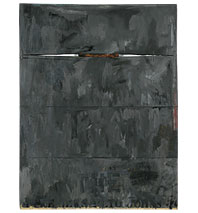
The last room of “Gray” shows you how much of a beginner Johns is willing to be as he attains a great late style. Unlike many famous artists, who switch on the autopilot and go into solipsistic production, Johns about ten years ago emptied out his work. Virtually everything disappeared. He began an oft-disparaged series known as the Catenary Paintings. In each of these large works, he suspended one or more strings from one edge of a mostly gray canvas to the other—they’re like pendants hung against flesh. Sometimes the surface displays smaller pictures of the Little Dipper, the Milky Way, or a fading harlequin pattern. The Little Dipper may have the North Star at its base, but there’s little to navigate these works. You’re left with what’s been there from the beginning, the resonant physicality of Johns’s art. The catenary paintings break free of the constraints of language. In a sense you’re left in the skin of the artist, literally holding on to these works by a string. For Johns’s painting has always been something more than just for looking. The Catenary Paintings seem to be about getting from one side to the other as naturally as possible.
Johns’s body and self have always been deeply embedded in his art, and that has deepened here. He has never been as cagey or removed as many have claimed. “Gray” is a powerful show because it allows you to see just how visceral, voluptuous, and vulnerable he’s been all along.

BACKSTORY
Though Jasper Johns’s 1996 MoMA retrospective was met with near-universal praise (“don’t miss this beautifully conceived and difficult exhibition,” advised the Times), his 1977 survey at the Whitney was a different story. The ever-cantankerous Hilton Kramer chastised the exhibition’s organizer for making Johns “look like a bore” and catalogue author Michael Crichton for “making him sound like an ass,” but ArtForum’s Rosalind Krauss dissented, describing an experience akin to “watching a poetic world notching piece by piece into place, seeing a universe of feeling slowly exfoliate from a restricted supply of imagery.”
Jasper Johns: Gray
The Metropolitan Museum of Art.
Through May 4.
E-mail: jerry_saltz@newyorkmag.com.