
Edward Tufte is most likely the world’s only graphic designer with roadies. “We own two of everything—amplifiers, digital projectors,” other A/V gear, he says. “One set moves up and down the West Coast, and one stays in the East, to keep the FedEx charges down.” He plays 35 or so dates a year, at $380 per ticket. Today’s is in a raddled old auditorium on 34th Street, over the Hammerstein Ballroom.
Like a musician’s tour to promote an album, this one—which will hit New York again in the fall—exists partly to sell Tufte’s four design books, the newest of which is titled Beautiful Evidence. But Tufte, through his own Graphics Press, is the book’s publisher, and he doesn’t do the usual quick month of hard promotion before heading back to his desk. He keeps going on the road, selling steadily, a few gigs a month, year after year. That may be why there are 1.4 million copies of his titles in print—a staggering figure for self-publishing. (The top seller, The Visual Display of Quantitative Information, has been a reliable mover since 1983.) And at these six-and-a-half-hour presentations, the audience starts cheering when he hits the floor, clamors for their books to be signed, buys posters at the table out front. As soon as the applause stops, Tufte bolts backstage, enthusiastically draining a Corona. “There are usually about 500 people who want to talk afterwards, and I’ve exhausted myself,” he says sheepishly. “I have to go hide out. Otherwise it takes hours.” This is all a good deal more lucrative than many author tours. “Thirty-five, forty dollars a book, 1.4 million copies?” he says, with a quizzical smile, when I ask about money. “You can multiply.”
And who are these fans who won’t leave? The majority are male, and wearing expensive rimless eyeglasses. Many are Web designers, creative directors, art directors, editors, architects. They come in knowing Tufte’s obsessions and coinages: Content-light splashy graphics, or “chartjunk,” are bad. Little repeated graphics displaying variations, or “small multiples,” are good. Microsoft’s PowerPoint software is an all-conquering monster of crumminess, a threat to life as we know it. Most of all, if you are making a presentation, you can probably say everything you need to on a single folded sheet of eleven-by-seventeen copy paper, and you ought to. Pretty much anyone who writes or presents can learn from Tufte, and those who have studied his work often speak of him as a kind of prophet. The iPhone is going to be the most talked-about object in America later this month, and the endless praise of Apple’s pared-down aesthetic is, in a way, his triumph.
A moment ago, I described Edward Tufte as a graphic designer, but that’s not exactly right. His field is almost sui generis, containing bits and pieces of art direction, data-crunching, economics, historical research, and plain old expository writing. It’s often labeled “information architecture,” or “analytic design.” Tufte himself describes it many ways, but one is drawn from a classic piece of science writing: “escaping Flatland,” or using paper’s two dimensions to convey several more. Another, more acidic description: “getting design out of fashion and out of the hands of Microsoft.”
His four books have collectively been called a Strunk and White for design. Tufte works by showing both outstanding and horrid graphics he’s found, improving upon the latter, and his principles take on the meditative quality of Zen koans: To clarify, add detail. And: Clutter is a failure of design, not an attribute of information.
Like its predecessors, Beautiful Evidence is a triumph of the book designer’s art, with exceedingly handsome, deeply instructive pages that are at once spare and dense. Tufte, as you may have guessed, is also that book designer, and says he couldn’t maintain his exacting standards any other way. And I believe him: A visit to edwardtufte.com reveals, in a discussion thread from last year, a cage match between Tufte and his paper supplier over some little black specks in the book’s recycled stock. The fight goes on far too long, building into inadvertent comedy, and Tufte, who admits to a prickly side and a decent ego, gets his way in the end.
How exactly does one create a discipline from scratch? Born in Kansas City, Tufte graduated from, of all places, Beverly Hills High School. His father was an engineer; his mother an English professor whose book on writing, Artful Sentences, is the only Graphics Press book not written by her son. Tufte’s job description evolved through studies of statistics (Stanford), a doctorate in political science (Yale), and a public-policy professorship (Princeton), as he saw a lot of data and thought about how to present it. He spent the eighties consulting with various companies (and with various degrees of frustration), from IBM to the New York Times.
Beautiful Evidence rings out variations on several Tufte themes, but it’s a little different from its predecessors in that it tries to reduce his case-study method to first principles, a set of six rules that have real-world applicability. (More koans, like Content counts most of all.) In particular, he dissects an image he’s used before. It’s a diagrammatic map showing Napoleon’s march to and from Moscow in the winter of 1812–1813. The map displays the facts—the army left Poland with 422,000 men, and came back with 10,000—and conveys the awful toll on several scales: the sinking temperature, the loss of nearly half the army during one frigid river crossing. Drafted by one Charles Minard in 1869, it “may be the best statistical graphic ever drawn,” and he sells prints through his Website. It is also, he’s said, about far more than data: “He did this because he hated war. It took me twenty years to notice it, but nowhere on this does he mention Napoleon. It doesn’t celebrate the surviving celebrity.” I’ve been in no fewer than three apartments lately where those prints are on the walls.
The other big introduction in this book is a tiny visual device Tufte calls a “sparkline.” It’s intended to convey a bunch of data, perhaps a couple of hundred numbers’ worth, in a space no larger than would be required for a couple of words, like this bit of medical monitoring:

Sparklines are aimed at the financial and sports pages, and you may soon see one in a newspaper or on a news site near you. A few papers already use them, and, as he points out, “Sparklines gets as many Google hits as Andy Warhol.” Tufte also suggests that, should you need to present data about, say, the bond market, you can fit a couple hundred of them on that eleven-by-seventeen sheet you should be using. Use both sides, and “that’s 800,000 numbers,” in entirely manageable form! Yes, this is very nerdy stuff—and then again it isn’t. The chief weapon in contemporary politics is framing the argument. A boiling-down of the health-care crisis to a set of crisp visuals could swing a lot of votes. Look what An Inconvenient Truth’s slideshow did.
Which brings us to those slides. About four years ago, Tufte began a minor crusade against Microsoft PowerPoint—he seems almost morally offended by its rigidity and clutter (“It’s a low-resolution screwup, like voice-mail menu systems”)—and a chunk of Beautiful Evidence is devoted to explicating quite how crappy it is. At his conferences, Tufte picks apart one particular PowerPoint slide, revealed during NASA’s inquest after the Columbia disaster. It’s from a set of slides so constrained by their own bullet points that they more or less convey the opposite of what they mean. The data said a rescue operation was in order; NASA’s managers understood that they had a go-ahead to land the Columbia. Seven dead.
PowerPoint may be a step backward, but the backlash is under way (Google “PowerPoint is evil” if you disagree) and there is abundant evidence that Tufte’s work is rising out of the Flatland of academia. His first book called out the Times’s lousy graphics; today, he says, the paper has some of the best. The current vogue for less-is-more minimalism, for ample white space, is traceable in part to Tufte, especially when it comes to a certain maker of MP3 players. In fact, when I ask him whom he’s never worked for but would like to, he leans in and says, “A-P-P-L-E! [But] they don’t need any help.”
The lovefest appears to be requited. In press photos of the iPhone, the device displays a New York Times Web front page on its screen. And that page contains a tiny ad for Beautiful Evidence, one that ran on the Times site for exactly one Sunday. Tufte thinks the cameo was a lucky break. I have no doubt that it’s an anonymous Apple designer’s thank-you note.
Tufte envisions Beautiful Evidence as the fourth book in a five-volume series, and I ask him what No. 5 might be. “No more staring at pixels on the screen. More staring at … what’s going into Real-land.” In other words, that new book may not be a book at all. “Movies, books, DVDs—I don’t know. It’s called ‘walking, seeing, and constructing,’ and it’s now in Spaceland. No more representations. Instead of designing with Adobe Illustrator, I’m designing with a Komatsu excavator.” The beginning of that change in focus appears at the end of Beautiful Evidence, in a digression about the display of fine art, including photos of his own sculptures. He says his ultimate goal is “to try to help people see better and more intensely. Seeing intensely”—probing the intersection where art and science and philosophy all meet. Off the printed page altogether, getting out of Flatland for good.
A classic Tufte case study.
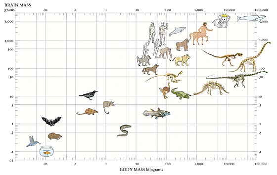
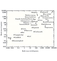
In Beautiful Evidence, Edward Tufte remakes a crude graph that first appears in Carl Sagan’s The Dragons of Eden. In the original, at right, bunched-up labels mislead the reader, making inappropriate visual connections (the Tyrannosaurus looks too close to the gorilla, for example), and the heavy frame dominates the composition. In the redesign, those busy little lines connecting data points to words are gone, and the frame and grid recede. In their place, the facts come to the fore, and lightness is allowed in (as is a bit of restrained whimsy, in the form of Babar).
SEE ALSO:
• A Classic Tufte Case Study
• Why He Hates PowerPoint