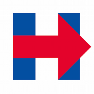
Yesterday there was a troubling development for that weirdo who’s going to decide she needs a 2016-themed face tattooo. Hillary Clinton unveiled her new logo, a blue H with a red arrow through the middle, and everyone on Twitter immediately decided that they hate it. Fortunately for Clinton, most Americans will not be selecting the next president based on who has the best branding, but the reasons people loathe the design are interesting. Some say it’s a subtle endorsement of the Republican Party. Others say it looks amateurish. And there are those who claim two equally sized vertical bars with a line through the middle clearly represent the Twin Towers (though that’s pretty much the only way to write a capital H). Basically, Hillary secretly gave America a Rorschach test, and the results are terrifying.
Complaint: Hillary stole the design.
WikiLeaks actually accused Clinton of logo plagiarism, but many on Twitter said it reminded them of the arrow hidden in the FedEx logo. For what it’s worth, Lindon Leader, who designed the FedEx logo, told Business Insider he doesn’t think Clinton stole his work … though he thinks her new symbol is “disappointing, amateurish, clumsy and decidedly static.”
Complaint: The logo is too Republican.
Complaint: The logo looks like it was designed by a young MS Paint enthusiast.
Or maybe even a kid who hasn’t graduated from building blocks.
Complaint: Hillary is trying to invoke 9/11.
People who are not Rudy Giuliani actually said this.
Complaint: There are secret Illuminati symbols embedded in the logo.
Complaint: There aren’t enough secret Illuminati symbols embedded in the logo.
Complaint: Hillary’s campaign logo draws too much attention to the person running for president.


