
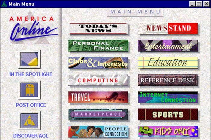
At the end of every year, the paint company Pantone picks a color that will symbolize the ~cultural zeitgeist~ of the coming year, spawning a hundred short trend-piece write-ups like the one you are reading right now. For 2016, those colors are straight from the vintage internet. “Rose quartz and serenity,” an airy pink set against a kind of saturated pale-blue, are floaty, inorganic, and look perfectly at home on a Tumblr page. It’s the same color combination found in this Prodigy guidebook and the America Online welcome page.
The pairing is a rarity, since the company usually only picks a single color. The choice isn’t just made-up — Pantone makes a careful study of new fashion lines and decorating trends, even polling designers as to what they think is cool. (Okay, fine, it’s still made-up, just much more elaborately than you think.) But there must be something in the air that points to these transcendent colors. Drake’s “Hotline Bling” video, with its nigh-virtual abstract spaces, uses almost exactly the same hues.
The Pantone colors have a long run of being relatively dull and organic. The most recent choice that has the same digital sheen as rose quartz and serenity is probably 2011’s honeysuckle, and that’s named after a plant rather than a metaphysical crystal or an abstract feeling. 2015’s color was marsala. The 2016 selection is a gesture at something different, a revisionary vibe. It’s no coincidence that the colors are also found on transgender-pride-flag designs, as Quartz points out.
The Pantone color video is a kind of faux-CGI rove through a woman’s billowing scarf, in a perfect Photoshop gradient of rose quartz and serenity, that seems like it could be pulled directly from an early-’90s screensaver. The tweet that it used as an announcement even turns the two colors into hashtags, a gesture that seems well-suited to a choice less of colors than of digital concepts.


