 |
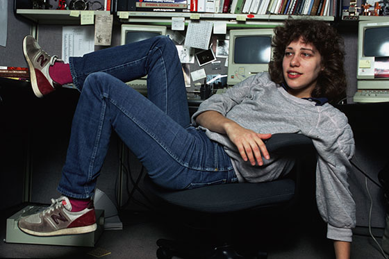
I started at Apple in 1982. I had come from an earlier era, of hand-lettering, of making paintings and sculptures and prints, classic fine arts. I had read up on type design in order to have an interview, because I was hoping to get this job making some bitmap faces and icons, and I had sketched some icons in a graph paper notebook. When I started, the first assignment I got on my very first day was to design a system font. There was a placeholder typeface in there, but they wanted something kind of bold so it would stand out, and what was there looked a little thin and jaggedy. I needed to make capital letters that could fit into a very small grid, seven squares wide, nine squares high. It took about a day, and I hammered out the capital letters and then the lowercase I didn’t even realize that there are 255 symbols total, and I wasn’t really done! The problem was, I didn’t want any lines that were jagged, so I made everything horizontal or vertical or on a 45-degree angle, which worked pretty well. I called it Elefont, because it was supposed to be big and heavy. Later it got named Chicago [the Apple programmer and designer] Andy Hertzfeld and I were from suburban Philadelphia, and we had named the fonts after stops on the Paoli commuter train, like Rosemont. And then Steve Jobs said, If they’re going to be cities, they need to be world-class cities.
This was my first time working with pixels, doing it on the screen. I really hadn’t designed anything on a computer, and I wasn’t someone who worked in grids. What became clear to me was that I really enjoyed the structure of that kind of design challenge, of working with relatively limited screen real estate. I went on to design icons which, unlike the font, had the element of symbolism, a different kind of problem to solve, because there was a concept along with the pixels. I still look for pixels in everything: Lego, needlework, mosaics. Cross-stitch fonts are a perfect analogy for what I was doing: There are 18th-century samplers that are perfect. And even though I work a lot in vector images now, where pixel count doesn’t matter as much, I still feel as though if you have that constraint, I’m your person.