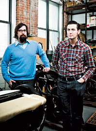
Patrick Fenton and Willy Schwenzfeier of Swayspace
You’re graphic designers who make cool, sometimes far-out, wedding invites. How did you hook up?
WS: At Stanford. Then we moved here and started Swayspace. We combine old technology with contemporary design.
PF: We have letterpress machines from 1895, 1904, 1920, and 1973.
Why not use modern technology?
PF: Part of the charm lies in the fact that each invitation is a bit different because they’re hand-fed.
What are the different process options a couple has when making their invitations from scratch?
WS: There’s letterpress, which results in debossed—or pressed in—type on the paper. Engraving is the opposite; it leaves the ink raised on the paper. Offset printing is the most common process, and the result is perfectly flat.
What should a couple bring to the initial meeting with a stationery designer?
WS: Whatever you’re excited about. A couple came with pictures of Frank Lloyd Wright windows, and that was something we could totally sink our teeth into. Have some idea, or else it can be massively stressful. Even if it’s just like, “Oh, thistles, I kind of like thistles,” or “I sort of like fields of grass.” There are no bad ideas—only bad implementations of them.
How customizable is the typeface?
WS: We love using the couple’s own handwriting and we customize letterforms all the time. Often the couple’s names need some tweaking to look their best.
Is there a particular font that everyone gravitates toward?
PF: Bickham. It’s elegant without being showy. It gets pleasantly ridiculous with so many capitals.
How have couples personalized their invitations to reflect the wedding?
PF: One invitation was inspired by Ischia, a volcanic island off the coast of Italy where they have a lot of lemon trees. We cut a really thin slice of lemon and scanned it, then printed it in blue.
WS: Short of damaging our equipment, we’re willing to take a shot and run just about anything through the press. This other couple got married in the Redwoods in California and their save-the-date was redwood veneer, literally a piece of wood. We made the type look like it was carved into it.
People are much more experimental with their invites now.
WS: Yeah, we had somebody who did one that looked like a formal invitation, but the wording was: “Hey. We’re getting married. And you should come and party all weekend.” I think that sends a pretty clear signal.
Can you make last-minute changes to the invite?
WS: Depends. If it’s North Haven Church instead of Westville Church, that’s trivial. If it’s “We need calla lilies rather than hibiscus,” well, that’s a massive change.
Anything else you’d advise against?
WS: If you’re going through all this effort to make this beautiful invitation, don’t muck it up by laser-printing directions, oddly folding them up, and sticking them in there. That type of information is better on a Website. We can design a site sympathetic to the invitation.
What about in terms of wording?
WS: Someone asked us the other day, “How can we make the invitation communicate that plus-ones aren’t welcome?” There are more normal conduits for conveying that information. Sometimes people want this poor little piece of paper to support more weight than it conceivably can.

Tip From the Trade
DIY INVITES
“Get a big custom rubber stamp so the whole invitation is one stamp. People will be like, ‘Whoa.’ ” Kit, $10.80 at speedballart.com.
718-596-3520; swayspace.com
Stamp Photo: Courtesy of Speedball Art