

Turmeric, lilac wine, and apricot. Yolk, sage, and cinnamon. No, not the ingredients of some autumnal cocktail recipe, but a few of the colorways you might find among the many DTC bedding brands offering “tonal” sheets, making it easier (and more affordable) than ever to create an enticing, cozy bedscape that’s not just made up of crisp hotel whites. This is especially true in the world of linen sheets, which are typically much more expensive than your sateens and percales and come in a wider range of (bolder) dyes. As the easy glamour of linen bedding becomes more accessible, we’re seeing new tonal bed moments, ones in which the duvet cover, sheets, and pillowcases may be different hues that complement one another, whether by color temperature or family.
A shift from the all-white bed that’s dominated every Instagram shot, celebrity home tour, and shelter-mag spread in recent years was inevitable. In Australia, Jes Saddington began hand-dyeing linen bedding in dreamy, delectable colors — lilac wine, valerian (a light, dusty rose), and lagoon (a soft sage), to name a few — and concocting the most surprising color combinations. Her company, Dazed but Amazed, considered one of the early pioneers of this trend toward a more chromatic bed scene, routinely sells out of its ready-dyed launches.
The bedroom’s function has also undergone a transformation over the course of the pandemic. “Beds have become more than places to rest during this time in our lives,” says Sunshine Abou Bakar, the blogger behind the website and Instagram account African Boheme. “They’ve morphed into offices, boardrooms, and classrooms, and white sheets just don’t feel all that welcoming.” (Plus, she says, “I have two small children and feel like white sheets would drive me crazy. I like my bed to be a sanctuary, and cleanliness is a part of that peace of mind. So the longer it takes for me to see crayon marks in my bed, the longer I can hold on to my zen.” Her signature color is what she likes to call “golden hour.”)
There are, of course, myriad non-white color combinations out there, but it can be difficult to know what goes with what. To help you curate the most inviting color story for your bed from scratch, we consulted interior designers, bedding stylists, and other aesthetically minded experts (like Bakar and Klein) for their advice, putting together bedding combinations from a range of our tried-and-true brands, as well as recommendations from our experts. The beauty of tonal bedding is that you can mix and match sheets, duvet covers, and pillows across companies and budgets, which we’ve reflected below.
Go monochromatic
Most of the experts we spoke to said there aren’t any hard-and-fast rules concerning color combinations, but if you’re looking for a foolproof place to start, you can’t go wrong with a monochromatic — or tonal — scheme. “A monochromatic bed can be just as interesting as a contrasting one,” says Steven Whitehead, a bedding and soft goods stylist whose clients include Neiman Marcus, the Company Store, and Pottery Barn. Still, he cautions, you want to “know what color you’re dealing with. If it’s red, is it cherry, tomato, oxblood, burgundy, or cranberry?” Laura Rucker, manager at Brooklyn home goods store Collyer’s Mansion, agrees that sticking with different shades in the same color family (all blues or all pinks, for instance) is an easy way to experiment with solid colors.
Go warm or cool
If a monochromatic bed feels too uniform, you can play with color temperatures, a strategy that Rucker and architecture and design critic Alexandra Lange recommend. (Warm colors are in the orange, red, and yellow family, while cool colors are in the blue, green, and purple.) “Pick warm or cool or neutrals and then mix within that,” says Lange, who prefers light sheets and suggests going from light to dark starting with pillowcases to sheets to duvet cover. In this scenario, Lange might combine aqua pillowcase cases with turquoise sheets and a navy duvet for a cool look, or white pillowcases with pale-gray sheets and a stormy duvet for a neutral look. Rucker points out that a trio of burnt-orange duvet, pink sheets, and mustard-pillow is an example of a warm look.
Don’t be afraid to mix materials
While we’re seeing a lot of crumpled linen bedscapes, you don’t have to stick with one type of fabric. In fact, Lee Mayer, CEO of online interior design service Havenly, says that creating a cozy and stylish bed scene is “all about layering and texture,” with Los Angeles–based interior designer Stefani Stein adding that mixing materials can feel “more effortless than perfectly matched.” Stein, Mayer, and Lange all agree that crisp cotton sheets like percale or sateen play nicely with a full and plush linen duvet cover. That’s because that pairing gives you, as Stein says, a “subtle contrast and some textural mix.” which, according to Mayer, “suggests ultimate coziness.” To create an even more pleasing scheme, Mayer recommends layering your bed with pillows and even a throw blanket in different fabrics — luxe velvets, organic linens — for more “textural dimension,” which is, of course, another opportunity to experiment with color accents.
And a few ideas
Keeping all of this in mind when you shop can be a little overwhelming, but Whitehead has a helpful hint: “If you’re mixing colors just try to keep them in similar hues and it will be more pleasing to the eye.” You can also start with a hero piece that can act as an anchor for your bedscape. Says Rucker, “A duvet can be the common denominator across different schemes.” If you want to play it safe, she suggests going with a cover that you can see yourself keeping long term, perhaps in a classic white or, if you want a touch of color, blush. That way you can have a little more fun and experiment with different pillows, which you can swap out more frequently. Mayer also takes this approach. “I will always recommend going for a light and bright sheet and duvet pairing, weaving in color accents through your pillows and blankets,” she says. To keep everything consistent, Whitehead recommends bringing along a color swatch, or simply keeping a photo of your hero piece on your phone. “As long as you have the colors right you can build a collection from multiple sources or vendors,” he says. If you’d rather leave the color mixology to the pros, here are a few ideas that you can use as a starting point for your bed.
Desert rose


The most common combination — and perhaps the trendiest one — is what we’ll call the “desert rose” trio, which brings dusty pink, mustard yellow, and terra-cotta linens (or a variation thereof) together (it’s also an example of a warm look, as Rucker noted above). “Mixing colors like sienna or camel with soft neutral shades, or even going a bit more bold with a rust-on-blush number” is an easy way to bring a bit of color into a room while staying a bit neutral, says Mayer. Emily Rose Klein, creative director and founder of lifestyle brand Colours, currently has her bed made up in a similar “sunset” palette. Her pillowcases are from Dazed but Amazed, which she calls “all-around amazing” for its “unique colors” and stonewashed linens. To get the look, try a mustard pillow, terra-cotta sheets from Morrow — these happen to be matte sateen, which is hard to come by in this color — and a pink-clay duvet cover.
Neutrals


For a truly neutral look, Mayer suggests “embracing light sand or a natural hue for your flat sheets and pillows to create some soft contrast with a crisp white duvet.” To add more depth while still keeping things mellow, she also recommends trying sheets in a slightly darker natural tone to create a contrast with your white duvet.
Pacific neutral

If that’s too much beige for you, Mayer also likes weaving in “dusty blue accents for a casual, Pacific-inspired vibe that feels relaxed yet refined.”
Go dark


While many people prefer light and bright, Stein actually opts for deeper colors. “A black — or navy, olive, dark green, etc. — linen duvet can be lovely in a moody bedroom,” she says. “It lends a relaxed quality to a look that, with another material, might feel quite glam.” As for what to pair with such a dark duvet, Stein says keep it dark. “I find that off-black, olive green, and navy are surprisingly lovely together.” And a word of advice from Mayer, if you’re going this route: “When it comes to darker-colored bedding (and even color combos) keep the sheets lighter than your duvet so they feel crisp and inviting, rather than heavy.”
Go complementary


For something a bit more surprising, both Rucker and Klein suggest pairing complementary colors together. “I think turquoise looks beautiful with orange because they complement one another on the color wheel,” says Klein.
And a couple ready-made sets…
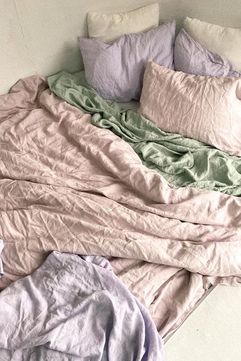
We love the intentional-but-unintentional look of this curated set from Dazed but Amazed, which includes a valerian duvet cover, lagoon fitted sheet, and lilac-wine pillowcases — like a pastel sunset. (Please note that the set does not include a flat sheet.)

Morrow also offers signature pairings, like this one that includes a duvet cover in fawn, fitted sheet in sage, and two pillowcases in yolk. (Please note that this set does not come with a flat sheet.)
The Strategist is designed to surface the most useful, expert recommendations for things to buy across the vast e-commerce landscape. Some of our latest conquests include the best acne treatments, rolling luggage, pillows for side sleepers, natural anxiety remedies, and bath towels. We update links when possible, but note that deals can expire and all prices are subject to change.